Examples of UX deliverables
If you are unfamiliar with the idea of User Experience design (UX), it may sound a bit ethereal or theoretical. It is actually anything but theory – think of it as the software world’s way of creating blueprints. I thought it might be useful to post a little portfolio of some real-life examples of UX documents so you can see what this is about.
Interview Reports
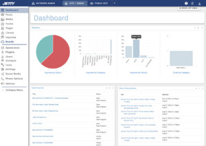
The beginning of User Experience Design is to research the desires and the frustrations of the users. The more users that can be interviewed the better! It is important to realize that random site visitors are not the only users of the system. The people who will be interacting with or processing the decisions of the end users also need consideration. The end result of these interviews should be a set of documents summarizing what was discovered. If the data came from a directed interview or an online survey, this could result in a spreadsheet, a document with verbiage and/or charts, or even an interactive dashboard. If the data came from a field visit or non-directed interviews, a textual summary of the results can be presented.
Personas
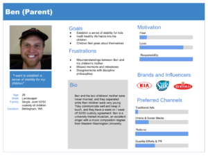
Personas are fictional characters created after lots of end-user interviews, created to represent the different types of users the system will be created to serve. The above persona was one of a few I created for a mobile app for young parents. These personas can be extremely useful in driving design decisions, marketing decisions, and even the development process. It helps to be able to keep in mind, in a very easy-to-remember way, the people for whom the system is being created.
Journey Maps
Journey Maps are diagrams that take a persona and imagine their path through discovering, purchasing, and receiving support for a product. They can really help pinpoint where a person may become frustrated and get lost, and to design ways to make sure people have a consistently positive experience across the board. Some people are starting to call this kind of thing “Customer Experience Design.”
Requirements Documentation
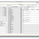
This is the kind of documentation produced in conjunction with the main business stakeholders and workers, to determine the kind of system that will best fulfill the results of the UX research. Actually this document in some ways can precede the interviews, so we know what business purpose the work of UX research is supposed to serve. This is the time when we get to brainstorm and imagine what we want the new system or site to do in the easiest possible way: we talk about it. As things become more clear, they get written down in a document so we can remember and review what we are going to do. This document will contain several key things about the system or site that is to be built. First, it can contain a statement about the business purpose of the site or system so that everyone is clear about why we are doing all of this work. It might also contain several lists of people who are concerned with the site or system to be built: a list of the stakeholders and what their interests are, the signatories who are the final decision makers for the design, and the different user groups and what their overall functions are in the system. It might also contain a data dictionary, which is a list of the kinds of data the organization uses, and a list of functions which means fairly detailed descriptions of what the different users actually need to do. It might also contain a list of reports that will need to be produced by the site or system for administrative oversight, and a description of the business requirements.
You can see a screen shot of a sample requirements document here: requirements_ss.png.
Miscellaneous Diagrams
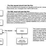
UX design documentation can take many forms. We make make diagrams with little stick figures and bubbles, called “use case” diagrams. This is very simple – it means we graphically show the different users of the system, along with what they do, and how their work flows and interrelates to one another. Swimlane diagrams can be extremely helpful in showing the flow of information and decision making from one type of user to the next. There may be flow diagrams, data state diagrams, and all kinds of other pieces of documentation. The thing to remember is that all of this is meant to make it easier for you or for the programmers who are going to build the system to understand how things are supposed to work.
Storyboards
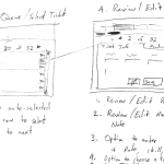
These are very undetailed, almost cartoonish quick drawings of the screens and application flow overviews that show what your system or site is going to look like. These are very useful for quickly creating an easily understood sense of the flow and nature of the new site or system. At this stage of development, it is easy to introduce changes and discuss features, because changes involve a pencil and an eraser and perhaps a new sheet of paper. Storyboards help to establish good communications between potential end users of a system and the designer. and the programmers.
See an example here: storyboards.pdf.
Wireframes
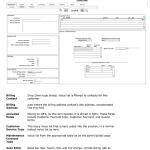
Wireframes are just what they sound like – more detailed black and white screen designs with line drawings of tabs, buttons, fields, and such, which represent more exactly how your site or system will function. Wireframes include very exact descriptions of the behaviors of individual objects and elements.
Wireframes are useful because they are still simple enough to change easily. They also focus the attention on the logic and function of the screens, instead of the color and look. The color and look need attention too, but nice looking graphics without good UX decisions makes for bad software. Wireframes focus like a laser on what really matters to make great digital products.
Wireframes can actually be produced which are interactive, allowing usability testing at this early design phase. Even if they are not interactive, wireframes are an important document for end users and stakeholders to review, and they may go through numerous iterations. Wireframing is a fantastic addition to the agile development process, because it allows extremely rapid iteration and adaptation.
See an example here: wireframe.pdf
Screen Mockups / Prototypes
Using tools like Sketch, Adobe XD, inVision, Figma, and many others, UX designers are able to create pixel perfect renditions of a system’s screens. They can even be made to appear to be marginally functional and interactive. These can be deployed in some cases online and used for usability testing, and for handoff to the development team. It must be emphasized that UX design is much much more than simply creating these screens. The screens have to reflect sound engineering decisions so that the real system will be performant and stable when it is deployed.
These mockups should in most cases show desktop screens and mobile device screens, as the responsive design decisions should not be left to the developers. It is the job of the UX designer to make these decisions and deliver them unambiguously to the development team.
User Stories and Acceptance Criteria
Even the most detailed interactive mockups will probably not be enough to convey the true functioning of a new system. I have discovered that detailed writeups describing the user’s experience using the screens, and detailed step-by-step acceptance criteria really help to explain the workings of the screens and the underlying system to the development team.

