Blu Sky – Recycling Service Provider Portal
The Client
Product Care Association is a Canadian company in Vancouver BC that manages the recycling of beds, paints, lightbulbs, and such throughout Canada and some states in the US. They coordinate the collection, transport, and processing of recyclables and manage the allocation of funds for these services.
The Problem
- The various companies which they call “partners” used an outdated and confusing system to report the collection, transport, and processing of recyclable materials in order to be remunerated for their services.
- They had also had some bad experiences with failed projects that were over budget and did not end up meeting their expectations. They kept asking, can you really handle this or not?
The Solution
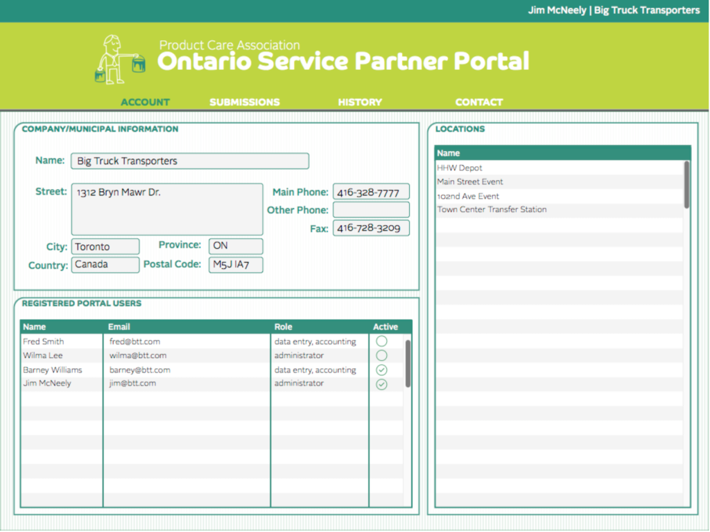
- They hired Blu Sky, where I did a full requirements analysis which was iterated numerous times before signoff.
- I reduced the legacy system’s dozen or more 1998 era style screens, down to one much simpler screen.
- I added a reporting and printout screen so users could review their submission history.
- I also did all of the front end programming for this using angular.js
- We also integrated this with their Microsoft Dynamics system
- I wireframed and implemented custom tables and screens for the Microsoft Dynamics system
The Success
- PCA was very happy with the system and the project was considered a great success
- They began to require a UX driven process with requirements documentation, wireframing, usability testing, visual mockups, etc. from their other vendors, because they saw how successful it was on this project. This became THE WAY for them, and I was The Mandalorian!
Wireframes
- I create very comprehensive wireframes. I design logins, password resets, popup dialogs, error messages, emails, printouts, etc. As far as possible, no detail is left out. Having been a front end developer, I hate leaving developers hanging with unfinished design details.
- Interactive wireframes were used for usability testing with end users all over Canada
Mockups
- Their branding document indicated some very strange lime green / forest green / purple colors, with unusual button shapes and quirky cartoon logos.
- I really loved this and embraced it. I made the data panel groupings also reflect the button shapes, and I grouped buttons using the shaping scheme as well. I also made sure that the highlight colors showing form input focus reflected these colors as well.